HPI Agro

/ OVERVIEW
Established in 2008, Hartono Plantation Indonesia (or usually abbreviated to HPI AGRO) is a multi-company that upholds the commitment to continue to synergize with the surrounding environment and be the front-runner.
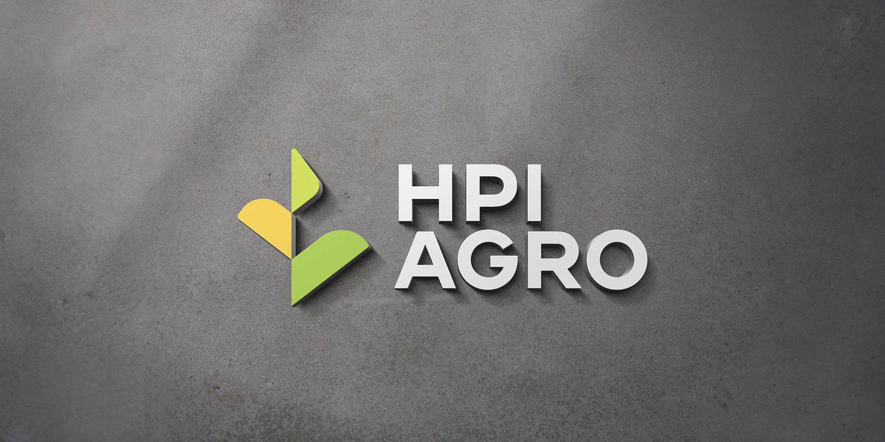
We redesigned HPI AGRO's logo to be fresh, yet bold. The new logo is taken from the basic form of plants that grow as a symbol of "growing in harmony". The upward angle signifies HPI AGRO will continue to grow in the future.
The main color represents HPI AGRO's freshness and boldness. The other colors in the logomark are chosen to complement the main color and to convey that HPI AGRO is a multi-company, more than a palm oil company, and the subsidiaries are in harmony with HPI AGRO to grow together. Grey color in the logotype is chosen to balance the bright and bold colors, it also symbolizes HPI AGRO as a company that is reliable, professional, and smart.


